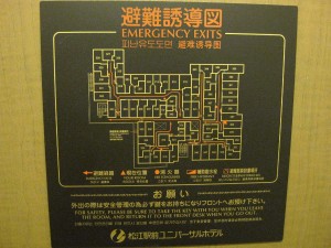
 Well, at least some of these rooms suck a heck of a lot more than others! This is a good example of terrible 1970’s Japanese commercial architecture. There was a onsen on the top floor, but it was for men only. There was a tiny women’s onsen, but you had to go to the front desk and leave a deposit for the key. The design was awful from the outside too.
Rants
it seems like chainring spacers are some kind of mystical vintage part. I've asked at almost every shop in whistler with a service department. Quite a few didn't even know what it was and couldn't comprehend what I wanted to do. Finally found some at Fanatyk Co but only ancient crusty mechanics know about these and they have poor eyesight or something. I asked for 3mm and he even used a ruler, he scrounged up 4mms.
- #Just saw Penzoil add on TV, closing line is synthetic oil, made from natural gas. Trying to have your cake & eat it?
- #Fabio has things reset.
- #
Recent Posts
More SNM
Categories
Archives
- October 2018
- June 2018
- May 2018
- April 2018
- March 2018
- January 2018
- December 2017
- November 2017
- October 2017
- September 2017
- August 2017
- July 2017
- June 2017
- May 2017
- April 2017
- March 2017
- February 2017
- January 2017
- December 2016
- November 2016
- October 2016
- September 2016
- August 2016
- July 2016
- June 2016
- May 2016
- April 2016
- March 2016
- February 2016
- January 2016
- October 2015
- September 2015
- August 2015
- July 2015
- June 2015
- May 2015
- April 2015
- March 2015
- February 2015
- January 2015
- December 2014
- November 2014
- October 2014
- September 2014
- August 2014
- July 2014
- June 2014
- May 2014
- April 2014
- March 2014
- February 2014
- January 2014
- December 2013
- November 2013
- October 2013
- September 2013
- August 2013
- July 2013
- June 2013
- May 2013
- April 2013
- March 2013
- February 2013
- January 2013
- December 2012
- November 2012
- October 2012
- September 2012
- August 2012
- July 2012
- June 2012
- May 2012
- April 2012
- March 2012
- February 2012
- January 2012
- December 2011
- November 2011
- October 2011
- September 2011
- August 2011
- July 2011
- June 2011
- May 2011
- April 2011
- March 2011
- February 2011
- January 2011
- December 2010
- November 2010
- October 2010
- September 2010
- August 2010
- July 2010
- June 2010
- May 2010
- April 2010
- March 2010
- February 2010
- January 2010
- December 2009
- November 2009
- October 2009
- September 2009
- August 2009
- July 2009
- June 2009
- May 2009
- April 2009
- March 2009
- February 2009
- January 2009
- December 2008
- November 2008
- October 2008
- September 2008
- August 2008
- July 2008
- June 2008
- May 2008
- April 2008
- March 2008
- February 2008
- January 2008
- December 2007
- November 2007
- October 2007
- September 2007
- August 2007
- July 2007
- June 2007
- May 2007
- April 2007
webcomic
Coming Soon!
0 Responses to “Floorplan from Heck”